pypref ‐ a Python port of rPref
There is also a Python port of rPref package, named "pypref" (Database Preferences and Skyline Computation in Python). The preference constructs (low, high, true and the usual complex preference operators) are very similar to rPref. The BNL algorithm (Block Nested Loop) for determining the optimal tuples is written in Cython, a C-Compiler supporting a Python-like syntax and making C-Extensions for Python quite simple.
The pypref package covers just a part of the rPref functionality. For example, grouped preferences are not supported at the moment. Note that the development state of pypref is "alpha". In contrast to rPref, there are currently no unit tests and the documentation is less detailed.
Download and install pypref
The current development version is available on GitHub. Have a look at the readme.rst file for instructions how to load the library.
Example 1 - Skyline plot
Now we revisit the the first two use cases from the rPref example page in pypref.
For the following code snippets we have to primarily load the pypref package and the matplotlib (as a visualization interface for the Skyline plots):
import matplotlib.pyplot as plt
We consider the mtcars data set from R, which is included in pypref as an example data set. We search for the optimal cars having a high horsepower and simultaneously a low fuel consumption (i.e., a high miles per gallon value).
In the following code snippet the optimal set of cars with respect to the preference "high horsepower and low fuel consumption" is calculated and the result is plotted. All pypref functions are printed bold.
mtcars = p.get_mtcars()
# preference for cars with minimal fuel consumption (high mpg value) and high power
pref = p.high("mpg") * p.high("hp")
def plot_skyline(dataset, pref):
# plot all points
plt.plot(dataset['mpg'], dataset['hp'], 'bo', fillstyle = "none")
# select optimal cars according to this preference (Skyline)
sky = pref.psel(dataset)
# highlight Skyline
plt.plot(sky['mpg'], sky['hp'], 'bo')
# show plot
plt.show()
plot_skyline(mtcars, pref)
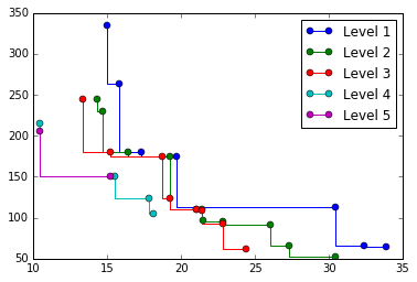
Example 2 - Level value plot
Again we consider the same preference and data set as in the previous example (i.e., we rely on the objects mtcars and pref from the example above). The Pareto-optimal set is defined as the Level-1 points. The Pareto optima of the remainder are the Level-2 points. The optimal points of the k-th remainder are the Level-(k+1) points. The level values of all tuples are retrieved by the psel function where the top-parameter indicates the number of tuples in the data set.
In the following code snippet we show the tuples of each level in a different color and plot the Pareto front line for each level.
# get level values for all tuples from the data set
res = pref.psel(dataset, top = len(dataset))
# plot each level front line in a different color
for level in range(1, res['_level'].max() + 1):
pts = res.loc[res['_level'] == level].sort_values("mpg")
plt.step(pts['mpg'], pts['hp'], 'o', label = "Level " + str(level))
# show legend and plot
plt.legend()
plt.show()
# show level plot for data set and preference as given above
plot_levels(mtcars, pref)
This produces the following plot:
More examples are given in pypref-examples.py on GitHub.