Examples
On this page we show some typical applications of Skylines and Preferences and explain the usage of our package with some code snippets. Take a look at the examples in the documentation to get more ideas on how to work with this package. Some of these examples also require the ggplot2, dplyr and igraph packages. All packages needed for the following examples can be installed with
install.packages("dplyr")
install.packages("igraph")
install.packages("ggplot")
All rPref functions are printed bold in the following.
Skyline plot
Consider goals which tend to be conflicting, e.g. horsepower and fuel consumption for cars. Let us take the mtcars data set from R, where mtcars$hp is the horsepower and mtcars$mpg is the inverse fuel consumption (miles per gallon, i.e. a high value indicates low fuel consumption).
In the following code snippet the optimal set of cars with respect to the preference "high horsepower and low fuel consumption" is calculated and the result is plotted:
sky1 <- psel(mtcars, high(mpg) * high(hp))
# Plot mpg and hp values of mtcars and highlight the skyline
ggplot(mtcars, aes(x = mpg, y = hp)) + geom_point(shape = 21) + geom_point(data = sky1, size = 3)

Pareto frontier and level value
Consider again the mtcars data set from R together with the high(mpg) * high(hp) preference.
Next to the Skyline points we want to plot the following information:
- The level value of each car. Level 1 means that the car is optimal for this preference. The optimal cars from the remainder (i.e., the data set without the optima) have level value 2. In general, the tuples of level n are retrieved by taking the maxima from the (n-1)-th remainder. Note that the layers of the Hasse diagram in the second example correspond to these level numbers.
- The Pareto frontier, i.e. the line connecting all optimal points such that the dominance area of these tuples is bounded by the frontier.
p <- high(mpg) * high(hp)
# Calculate the level-value w.r.t. p by using top-all
res <- psel(mtcars, p, top = nrow(mtcars))
# Visualize the level values by the color of the points
gp <- ggplot(res, aes(x = mpg, y = hp, color = factor(.level))) +
geom_point(size = 3)
gp
The result of the visualization is:

Additionally we want to plot the Pareto front line for every, indicating the area of all points of a lower level. To this end we use the geom_step function from ggplot:
This results in the following graphic:

Grouped Skyline
Sometimes one may be interested in the Skyline on a partitioned data set where the Skyline is calculated for each partition separately. The dplyr package provides a very convenient way to partition data sets. The rPref package respects the given grouping, i.e., the preference selection preserves these groups and operates on each group separately.
The following code builds partitions of the mtcars data set with regard to the amount of cylinders (the mtcars$cyl variable). Next, the same Skyline as above (high mpg and high horsepower) is calculated for each group. This is done in the following code snippet:
library(dplyr)
df <- group_by(mtcars, cyl)
# Calculate Grouped Skyline
sky2 <- psel(df, high(mpg) * high(hp))
Source: local data frame [3 x 2]
cyl skyline_size
1 4 3
2 6 2
3 8 4
geom_point(aes(color = factor(sky2$cyl)), sky2, size = 3)

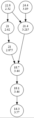
Better-Than-Graph for the preference order
To get a better understanding of the preference order we will visualize the Better-Than-Graph of a preference. Formally it is a Hasse diagram showing all the better-than-relationships of the preference on a given domain. As an example we consider the Pareto preference high(mpg) * low(wt) to search for cars with a low fuel consumption and a low weight.
The plotting itself can be done in three different ways:
- With the plot_btg function using the Rgraphviz package (if available) based on the dot layouter.
- With the plot_btg function with parameter use_dot = FALSE using the igraph package.
- With the get_btg_dot function and an external Graphviz/dot interpreter (see ?get_btg_dot, not explained here)
df <- mtcars[1:8,]
pref <- high(mpg) * low(wt)
btg <- get_btg(df, pref)
# Create labels for the nodes containing relevant values
labels <- paste0(df$mpg, "\n", df$wt)
We get the following two diagrams: